There you are - Illustration Process
Table of Contents
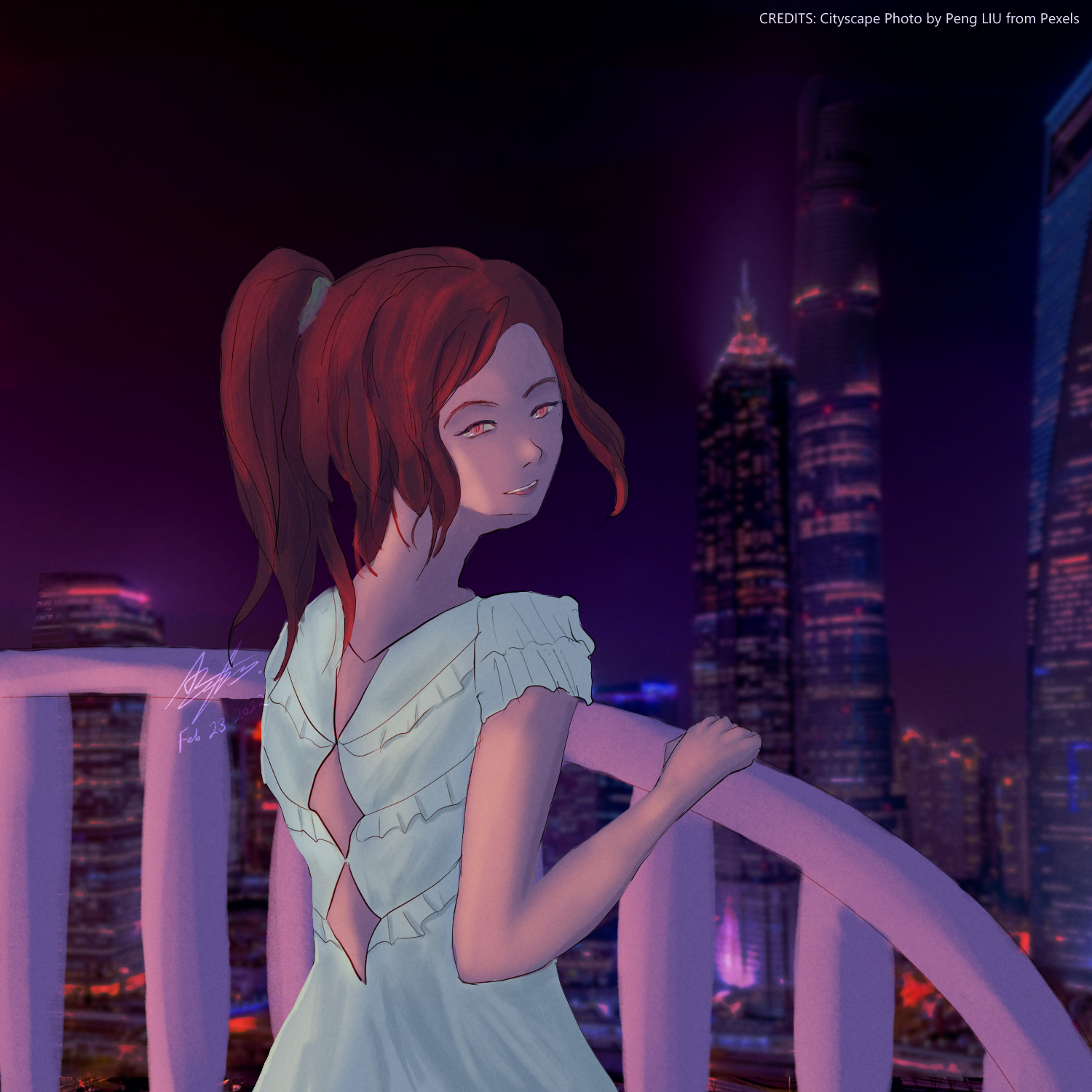
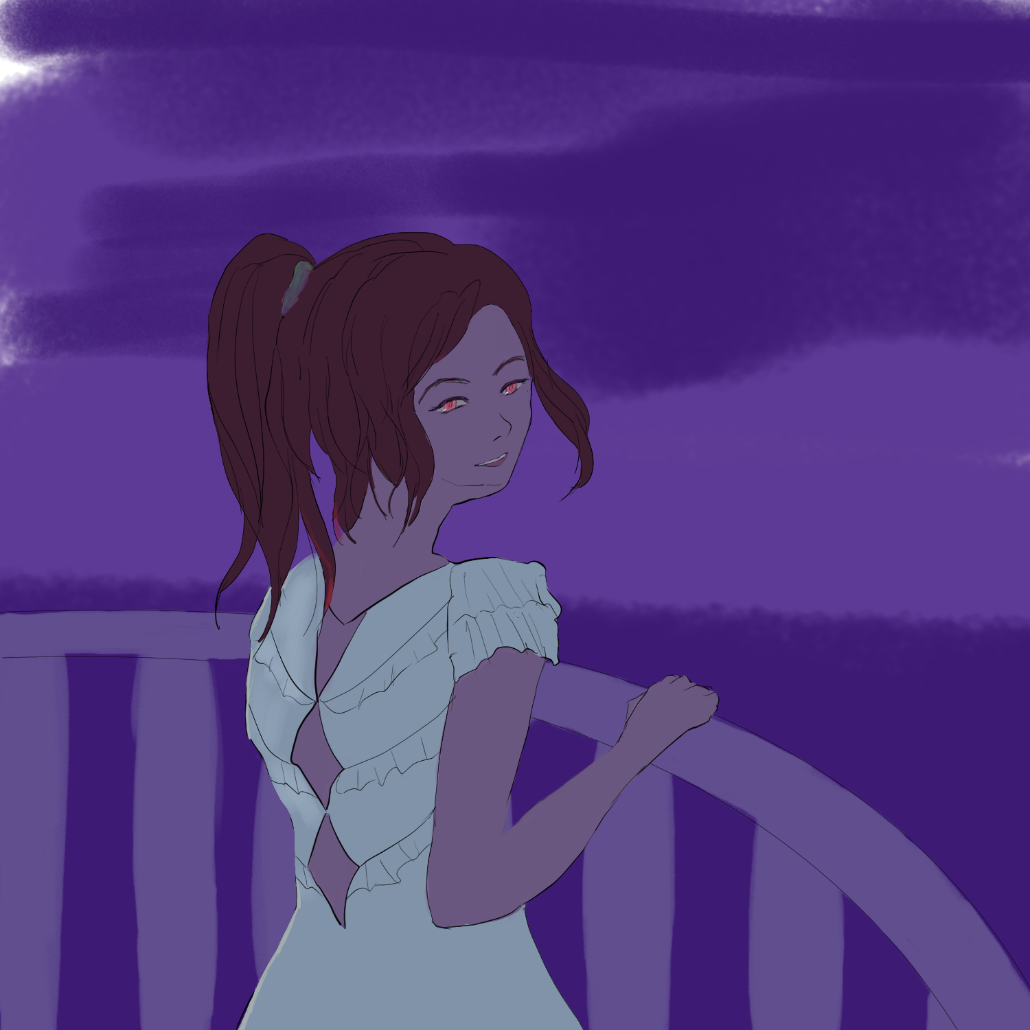
I’m very happy with the newest piece of art I put out, titled “There You Are”. It started with an idea of the subject looking at the city skylines from a balcony like place, where she looks over her shoulder to see her love interest calling her name.
Sketch #
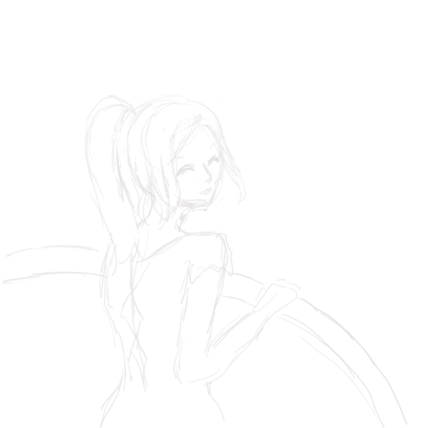
I usually have a bad habit of not using references, but at least this time around I did. I searched up “Girl looking over shoulder” and tried to draw what I observed from the photo thumbnails. I wanted her hand to be on the railing and I didn’t find the perfect pose for that so I just drew what I could see from imagination. I’m not particularly an expert on fabrics, but I tried designing a dress with diamond openings mainly because it looks fancy.
Lineart #
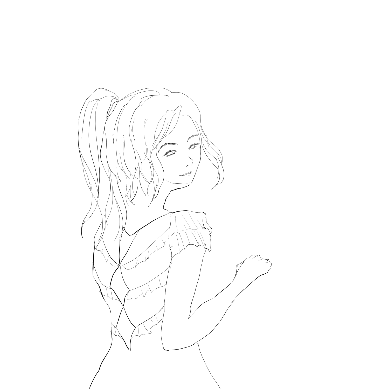
I find it much easier to execute lineart when the sketch has a thick enough line so I don’t feel like I’m tracing over my own art. Tracing thin sketches usually leads to shaky, artificial lines instead of smooth, confident lines. This time around, I use thicker lines for the sketch and thinner lines for my lineart.
Color Testing and Base Color #
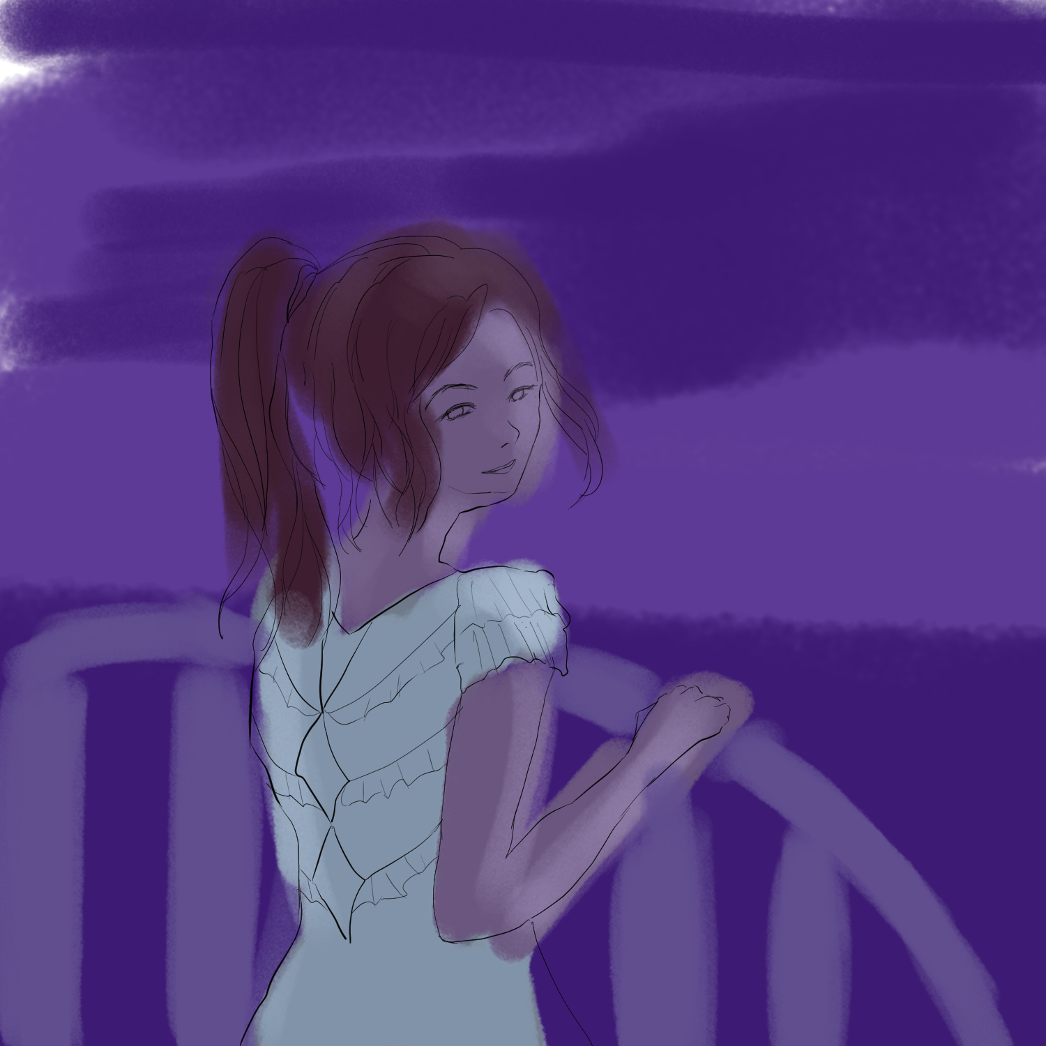
Coloring a nighttime scenario is definitely tricky because I’m used to picking pale beige colors instead of muted grey colors. I looked at some Twitter anime art and WLOP drawings to emulate a suitable palette. It’s really messy but I fill the coloring neatly after I have settled on the main colors.
Soft Light #
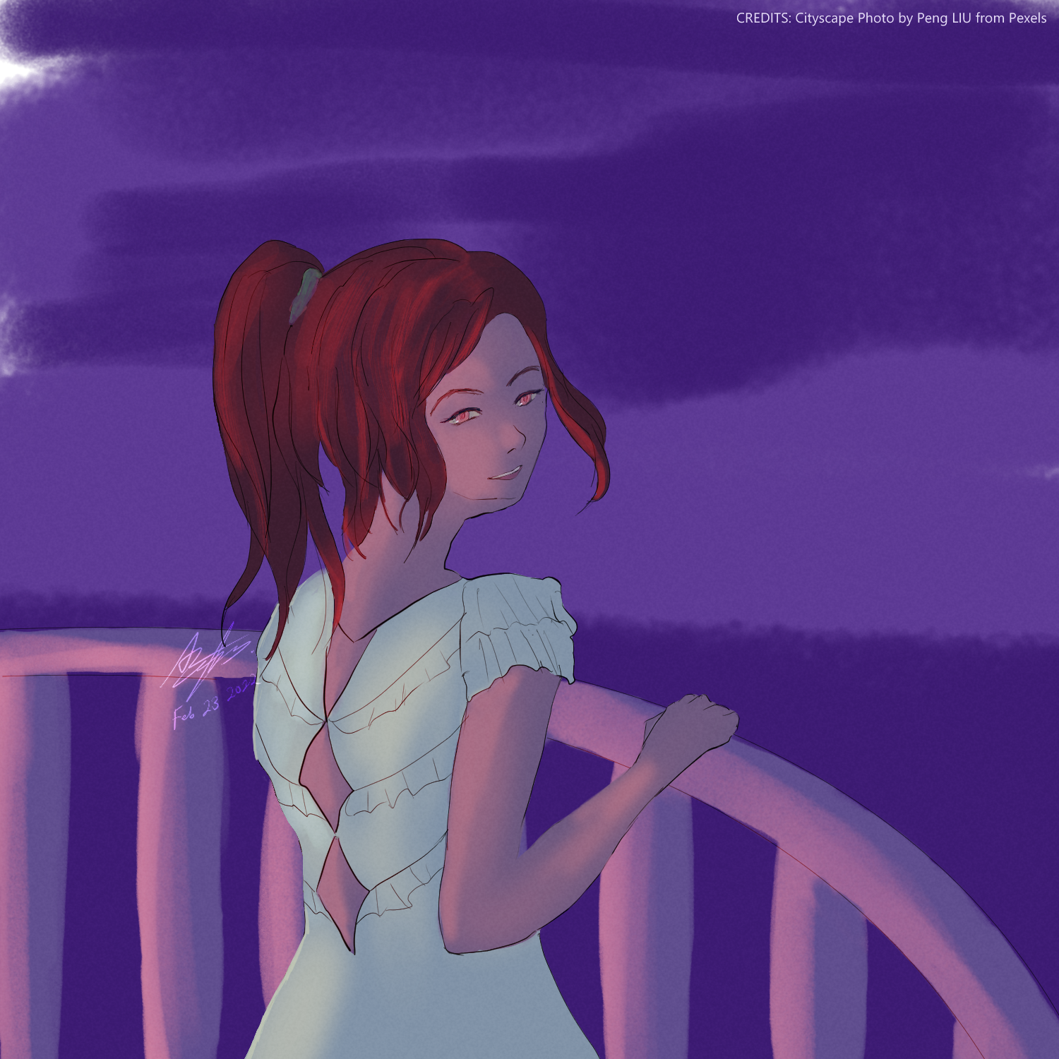
Assuming that indoor lights shine on the balcony, I put down some soft lighting on the back. Using Color Dodge layer on 40-ish percent opacity, a deep orange color makes for vibrant lighting, which is how I give color to the skin. The grey color that I start with becomes the color of the form shadow rather than the color of the skin.
Hard Light and Cast Shadow #
I place a second Color Dodge layer to accentuate the light, and a Darken layer to add some cast shadows, both at around 40-ish percent opacity. Color Dodge layers stack well with each other.
Photograph Backdrop and Final Touches #
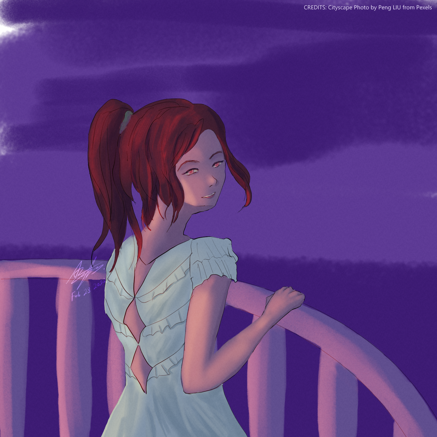
Using the cityscape photo was unplanned, but unfortunately, I tried constructing the buildings myself and couldn’t get that quite right, it looked mostly flat and lifeless. However, Pexels had some really nice cityscape photos that I could manipulate to match the composition, so I’m very happy with the end result. Until next time!